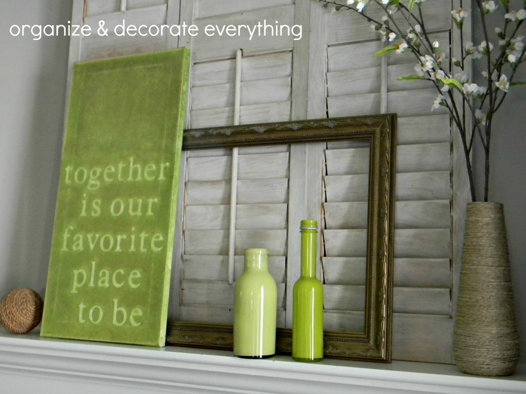
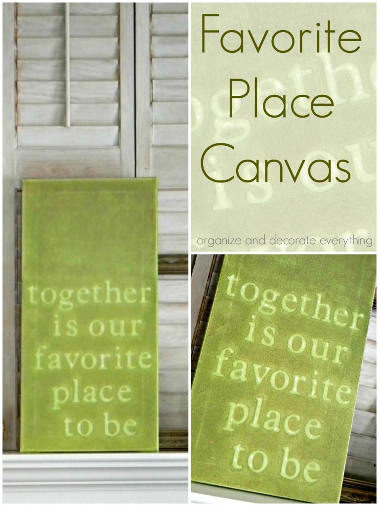
This post could actually be titled – How Not to Paint on Canvas. I’m going to tell you everything I did wrong and how I would do it differently next time. I have to say that I’m surprised after everything I did wrong that I actually don’t mind how it turned out. I don’t hate it! In fact, it’s growing on me. Maybe it’s all the blood, sweat and tears I put into this Favorite Place Canvas (only partially kidding).
Supplies needed:
canvas or wood
personal cutting machine or letter stickers
vinyl
tattered angels glimmer mist
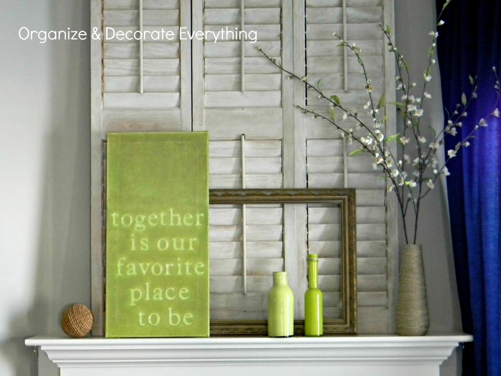
I won’t use canvas for this type of project again, next time I will use wood. I had the canvas on hand so that’s what I used. I also had plenty of scrap wood so I don’t know why I didn’t use that instead. Don’t get me wrong, I love canvas and can’t wait to use it for another painting project.
Okay, so you know me. I was trying to save money and not take a trip to the craft store so I used shelf liner I had on hand to make the letters. It’s a lot cheaper than vinyl but doesn’t stick to canvas very well. I think it would stick fine on wood though. To be better prepared, I bought more vinyl to have around for next time. Can you tell I don’t like making last minute trips to the craft store?
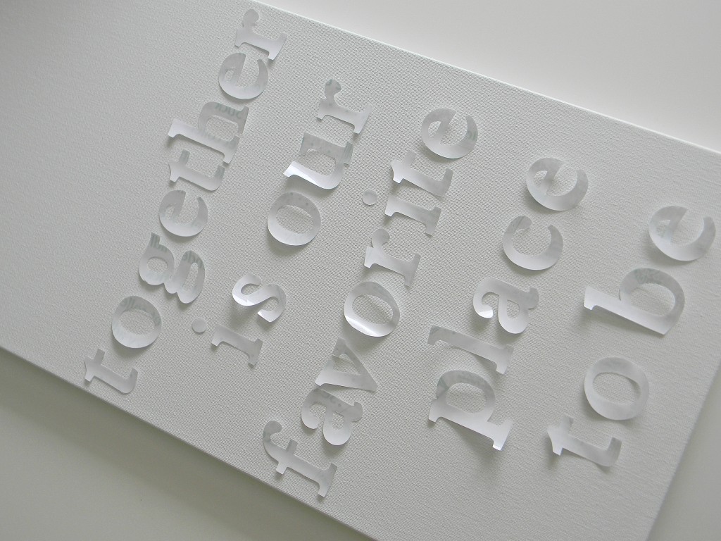
I have to say that my Cricut cut the shelf liner very nicely though. If you don’t have a cutting machine any sticky letters will work fine. I placed the laminate on the canvas using a ruler to space the lines. You don’t need to measure between the letters. Just eyeball it.
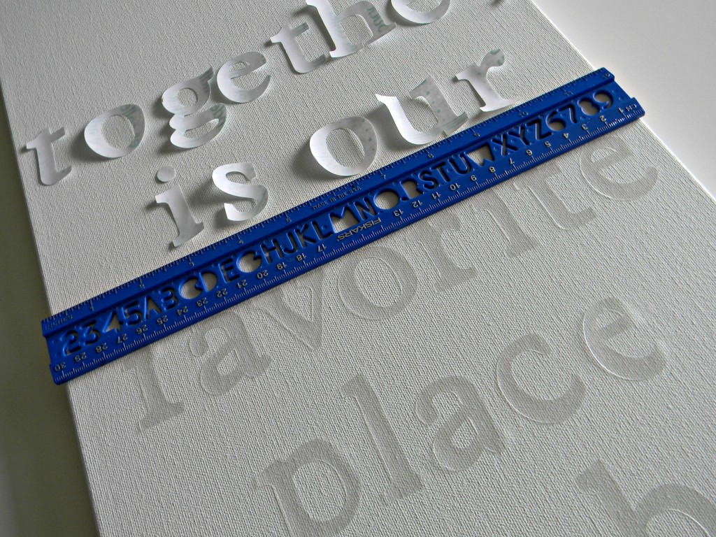
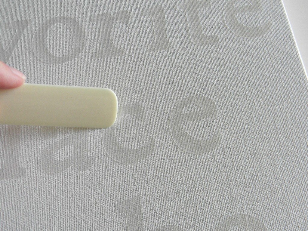
The letters weren’t sticking very well so I used a bone folder and rubbed each letter into place. I thought they were rubbed down really good. Um, not so much.
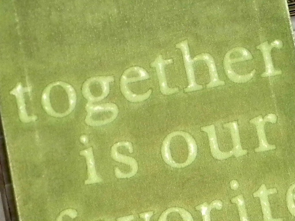
I saw this Tattered Angels Glimmer Mist at Michaels and had been wanting to try it. The color is Kiwi. I was going for a uneven kind of old worn look so it was perfect for that. I actually love the look it gave the canvas.
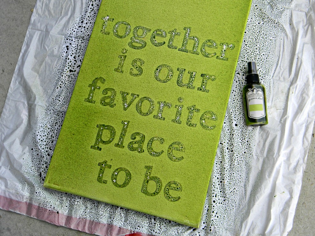
The problem was the letters weren’t stuck down very well, remember? So after the paint dried I started taking the letters off and there was wet paint under all the letters. I hurried and dabbed the wet paint off with a paper towel under each letter. That’s why the letters are blotchy and not white. I was going for solid white, but I have to admit this doesn’t look too bad.
At this point I should have been happy with it and just left it alone. It didn’t look too bad but there was an area where the paint was a little darker than the rest and I wanted to even it out. Why didn’t I just leave it alone? I used a tiny bit of acetone on a damp cloth and tried to lightly wipe some of it off. Disaster! I spent the next hour using different brushes and methods to blend everything back in. Learn from me, leave your projects alone and enjoy their little imperfections.
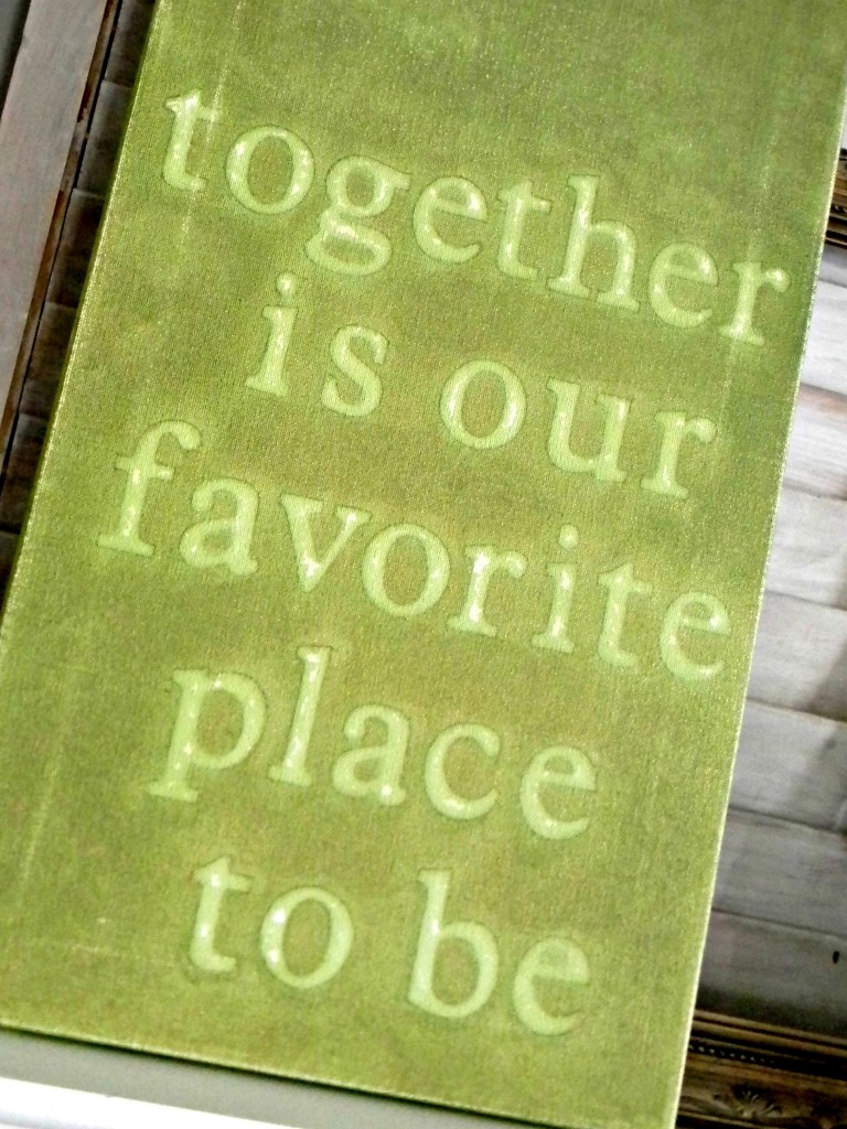
After I did my best blending it, I let it dry then sanded it a bit to make it look like everything was intentional. I really kind of like it now and the glimmer mist gives it a little shimmer. If nothing else I love the sentiment the most and I think it looks pretty great on my mantel. So, the moral of this craft project is – sometimes you have to spend a little money to get what you want or some mistakes turn out just fine.